Best Examples of Mobile Websites
Written By: ShaneWebGuy on July 8, 2020
In March 2020, Google announced the rollout of the mobile-first indexing for the entire Web. This decision will have an immeasurable impact on search and how businesses will carry out their digital operations.
Ecommerce websites and other digital marketing efforts will have to adapt to this newest evolution in search. We have known for years that Google has shifted to prioritizing mobile websites in search results. According to Google, their Googlebot crawler has increased its indexing activities to update its records of websites.
Occasionally, the older/traditional Googlebot that is focused on the desktop version of websites will also continue its work. The important reminder here is that the smartphone user-agent Googlebot will be doing most heavy lifting from now on.
Don’t forget to check out the status of your website through the Google Console. The crawl status of your website will be displayed on the Settings page. The URL Inspection Tool will also provide additional information on the status of individual URLs on your website.
In the meantime, let’s check out what the champions of mobile-first have been doing and how they have been staying on top with their UI and UX.
Tesla Motors
The Tesla Motors website is highly readable, loads quickly, and is easy on the eyes when viewed with any mobile device. The buttons are easy to use, and you won’t fumble trying to navigate one page to another. They focused on the aesthetics of the page, too.
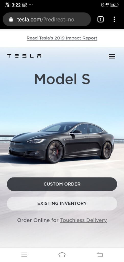
The art direction is highly suitable for what they are trying to achieve, which is selling cars in the future. While there are loads of details and interactive features, the designers also paid attention to how much white space is available on each segment of every page.
White space is important for balancing visual elements. The CTAs aren’t hard to find, and they are also clear and engaging. Accent colors make Tesla Motors’ mobile website very stylish and clean-looking, too.
Bloomberg Businessweek

It might be surprising to find Bloomberg Businessweek here since news websites are normally packed with so much material that it’s hard to understand what’s going on. Readability is not a problem with the Bloomberg Businessweek mobile website.
The website is engaging while maintaining a formal theme with its website. Striking colors are used to segment and differentiate sections from one another. The navigation is easy to use, and overall, the website is easy on the eyes, encouraging readers to continue scrolling and reading.
Lyft

Lyft’s website maximizes the potential of large typography. The content is crisp and snappy while maintaining a good level of information.
There is a deliberate use of easy to see and easy to use icons and buttons to improve the website’s usability. Lyft has also done a good job of segmenting the menu sections, so people can quickly find what they need. There is no confusion about information for drivers and Lyft riders or passengers.
The menu is also the best way to jump to other parts of the website. Lyft has done a splendid job in centralizing the navigation, so there is zero friction. Search engines like Google and Bing highly recommend the “zero friction” method in website design.
Apple

Apple’s website is the Elysian Fields of all things related to the brand. Like their gadgets, the mobile website is simple yet sleek and packed with features.
Apple’s website was geared toward product exploration, so users can easily pass through different slides or pages of content to find out more about the products they are interested in.
All of the pages have a prominent header, a subheader identifying the page content, and a menu for easy navigation. Apple has filled the website with dynamic product photography that serves as a “slide” for readers. Each successive product image pulls in the reader even more.
Adobe
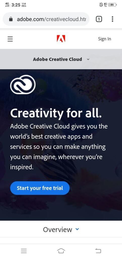
Adobe offers a wide range of software solutions for different kinds of users. Their mobile website is designed to guide users to the right solution that they may be looking for.
For a company with a wide range of products, it’s easy to get lost in trying to present all of them while keeping the structure simple and easy to understand. They used a global to granular approach in designing their menu. Adobe has clearly outlined its product categories, and you won’t have trouble finding what you need. The individual pages have clear outlines of product information to help buyers decide. There is also a “sticky” custom menu presenting subcategories for each general category that you access. This special menu continues to be available as the user accesses even more granular information about specific products.
Slack

Slack is a project management system that emphasizes close coordination and communication between team members. The mobile website’s goal is to get people to sign up for the service. The typography is clear and vibrant, and the CTAs are as direct as can be.
You will get a link to download the Android or Apple version of the Slack app. There is also a fast jump to more information about the system just below the download button.
Slack has streamlined their design but it is information-heavy as you continue scrolling. They’ve kept the most important links above the fold and additional information below.
Booking.com
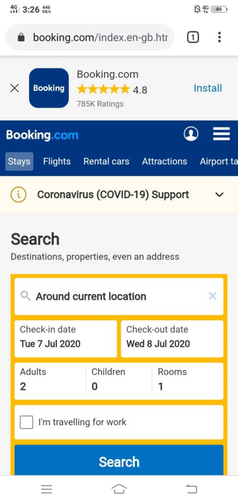
The Booking.com website is super simple to use and immediately grants the user access to Booking.com’s database. They made it as simple as possible to encourage all kinds of users to try the service, especially the “first-timers.”
Booking.com makes it easier for people to search for hotels and other properties nearest to their location. The previews or snippets of internal search results include photographs of the hotel, current pricing, and available ratings from other users.
Summary:
Ecommerce websites would do well to follow the lead of these seven websites and others who have paid closer attention to their mobile website design. We can give your website the edge it needs in this era of mobile-first indexing. Find out more by contacting us today.